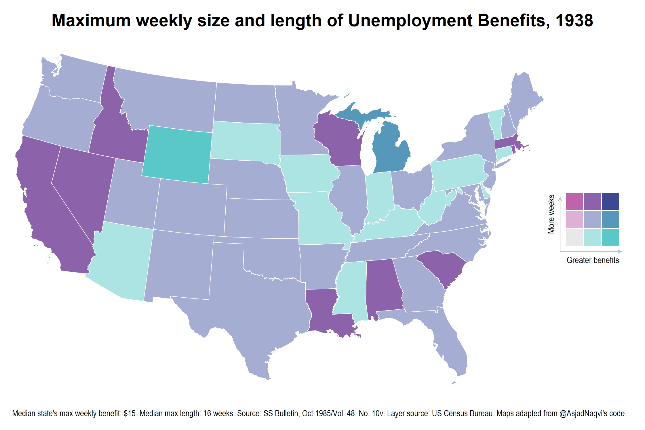
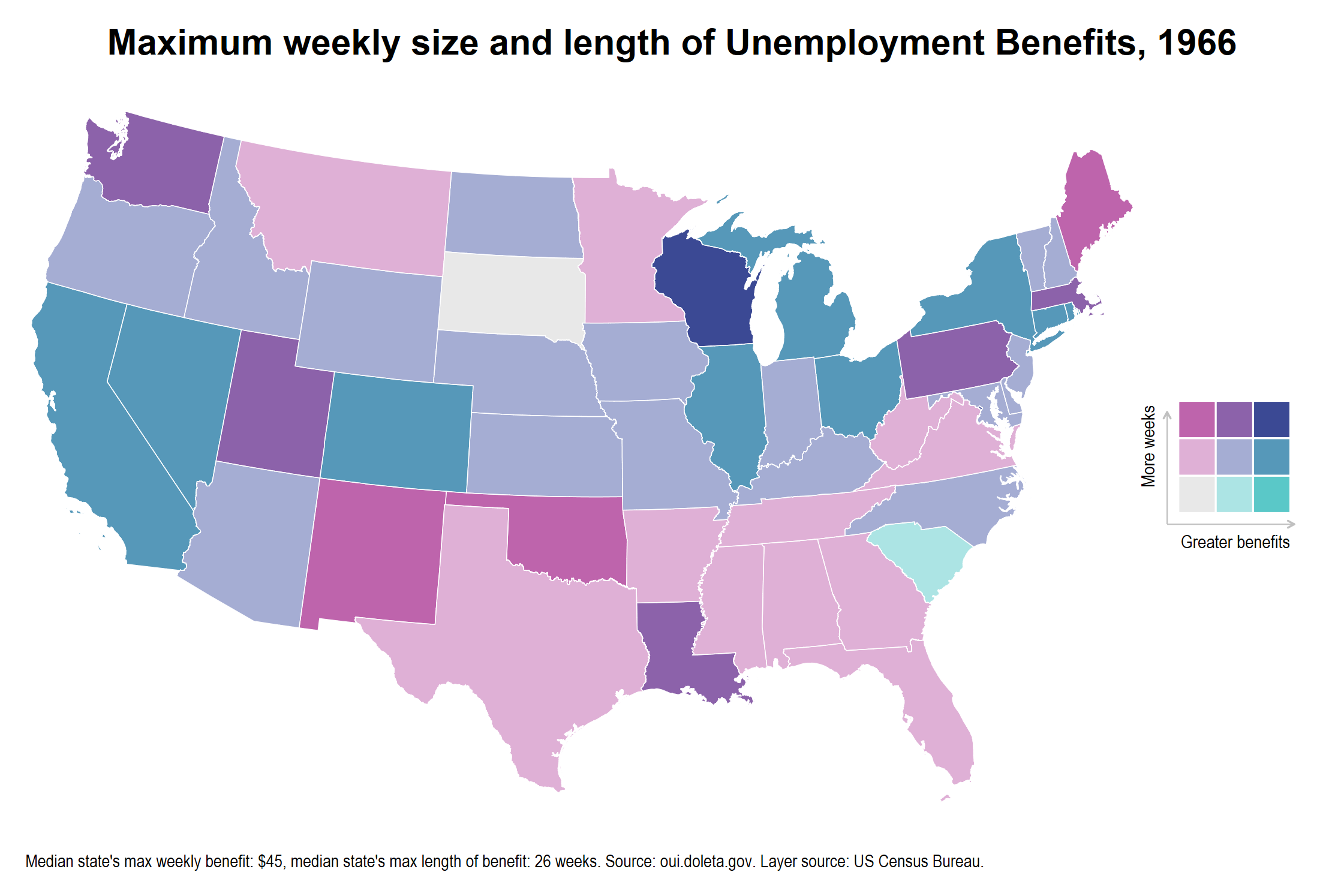
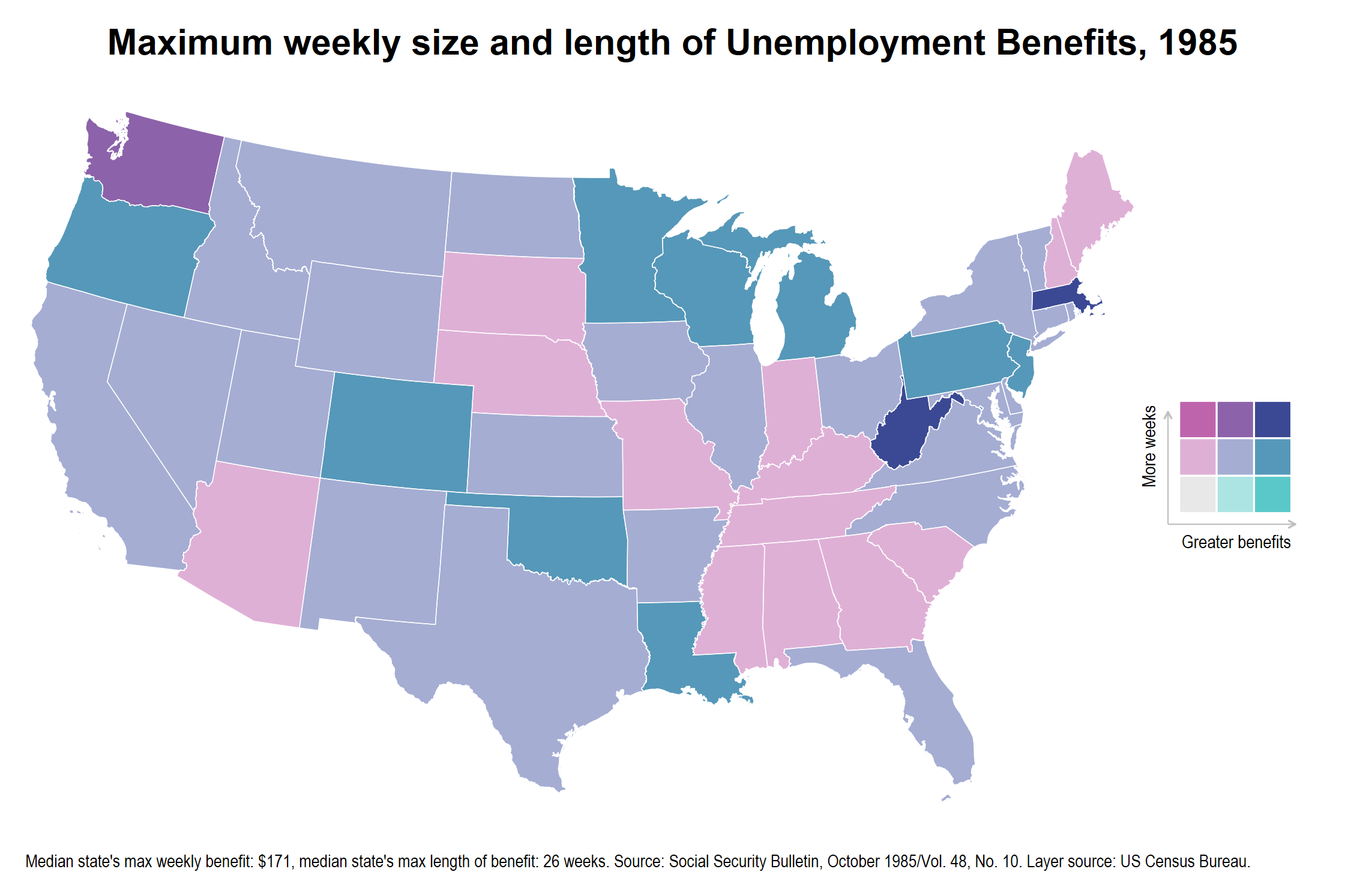
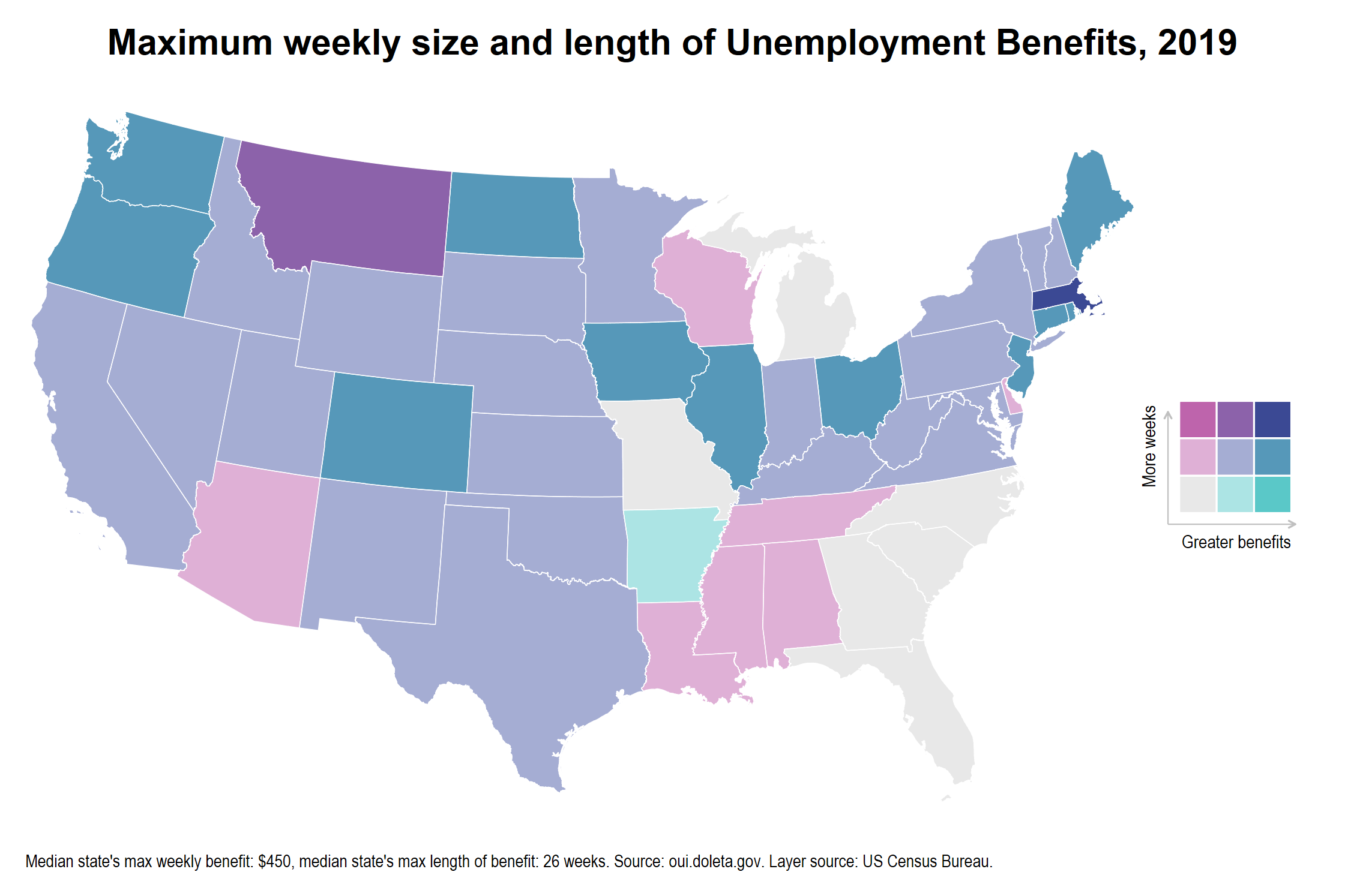
I created these maps in Stata while working on a history paper to discuss how UI coverage has changed across time. Light purple indicates that a state is in the middle 50% of states for weekly maxium benefit generosity and has the median maxium number of weeks.